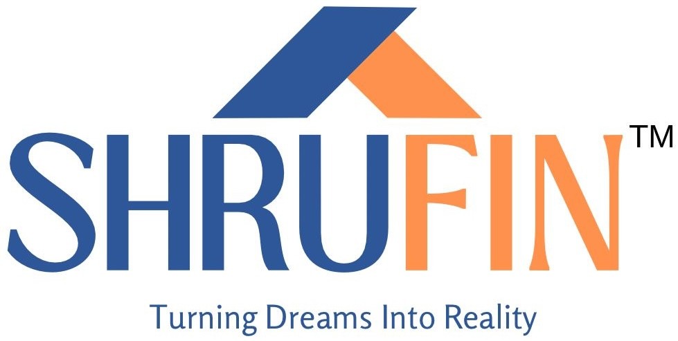
SHRUFIN Logo Design
SHRUFIN is a financial services company that offers loans and insurance solutions to meet customer needs. They needed a logo that looked professional and approachable, aligning with their mission: "Turning Dreams Into Reality." The goal was to design a logo that represents their brand values and works well across digital and print platforms.
How I Started
The project began with an understanding of SHRUFIN's core values and business objectives. Since SHRUFIN operates in the financial sector, the goal was to design a logo that balances professionalism with approachability. I conducted initial brainstorming sessions and competitive analysis to identify key design elements that would make the brand stand out while maintaining trustworthiness.
Design Objectives
Professionalism and Trust - Create a logo that builds credibility, as SHRUFIN deals with sensitive financial matters.
Approachability - Make the design feel welcoming and reassuring to customers.
Versatility - Ensure the logo works well on all mediums, like websites, print materials, and marketing assets.
Brand Mission - Reflect the idea of helping customers achieve their dreams with reliable financial services.
Project Process
To create a strong and meaningful logo for SHRUFIN, I followed a step-by-step process that included research, conceptualization, and refinement.
Research
Before diving into the design, I researched industry trends and competitor logos to ensure that SHRUFIN’s branding would be unique and effective. Financial service providers typically use blue to convey trust and stability, while warm colors add a sense of energy and optimism. Understanding these trends helped shape the overall design approach.
Wireframe
I created wireframes and rough sketches to explore different logo concepts, focusing on typography, icon placement, and overall layout. This stage allowed me to refine the visual structure before moving into the digital design phase, ensuring a balanced and cohesive final product.
Typography
I chose the font Loubag Medium for the logo. It’s clean, modern, and gives a professional look while making the name stand out.
UI/UX Design
Blue: Represents trust, reliability, and stability qualities important for a financial services provider.
Orange: Adds energy, optimism, and warmth, tying into the company’s mission of enabling dreams.
Iconography
I designed a triangular, roof-like icon above the name to represent a home. It’s a universal symbol of financial security and connects to SHRUFIN’s role in helping customers with foundational goals like homeownership.
Tagline Addition
I added the tagline "Turning Dreams Into Reality" in a simple and clear font below the logo. This reinforces SHRUFIN’s mission while creating an emotional connection with customers.
Impact
The logo turned out to be a great representation of SHRUFIN’s values. It’s professional and trustworthy while still feeling approachable and optimistic. The client was very happy with how well the logo communicates their mission and how versatile it is across different platforms like websites and marketing materials.
Final Deliverables
The logo was delivered in multiple formats, including:
Vector (AI, EPS) for scalability
PNG for web use
JPEG for presentations
Final Logo Design
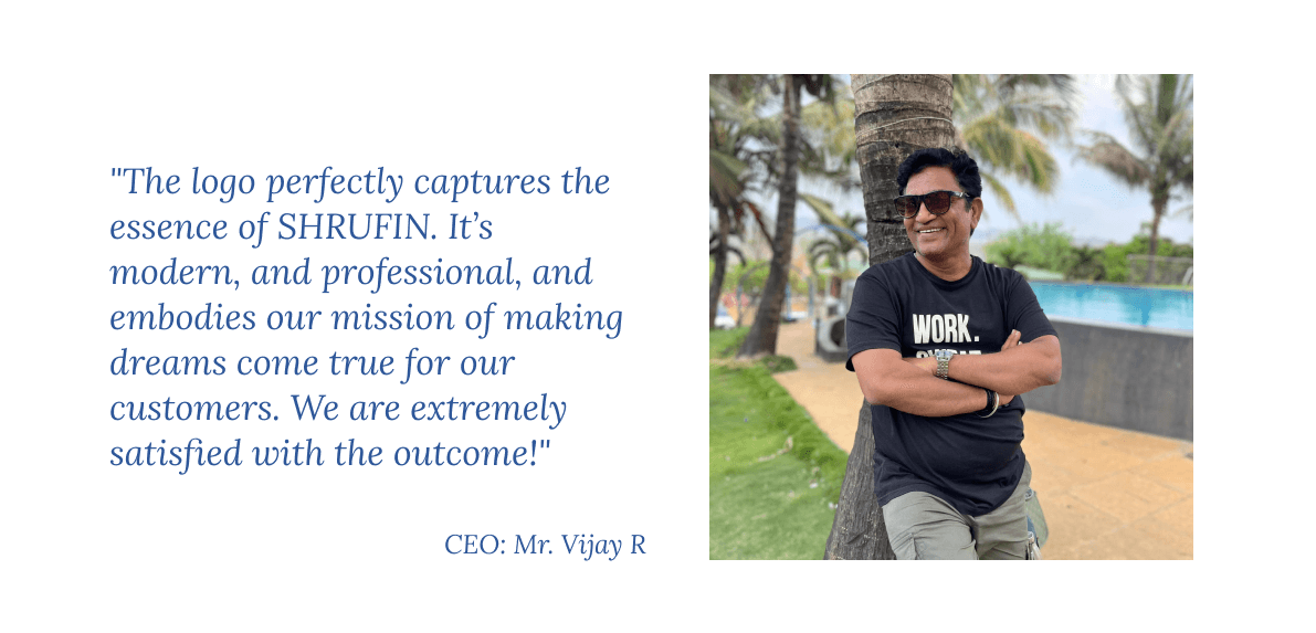
Client Feedback