ApnaRupee Website Redesign
ApnaRupee is a digital platform offering various loan and insurance services. However, users found the website outdated, difficult to navigate, and lacking accessibility features. The redesign aimed to improve information hierarchy, enhance accessibility, and ensure a smooth user experience—especially for users seeking financial information quickly and confidently.
Website Link - www.apnarupee.com
Key Issues and Solutions
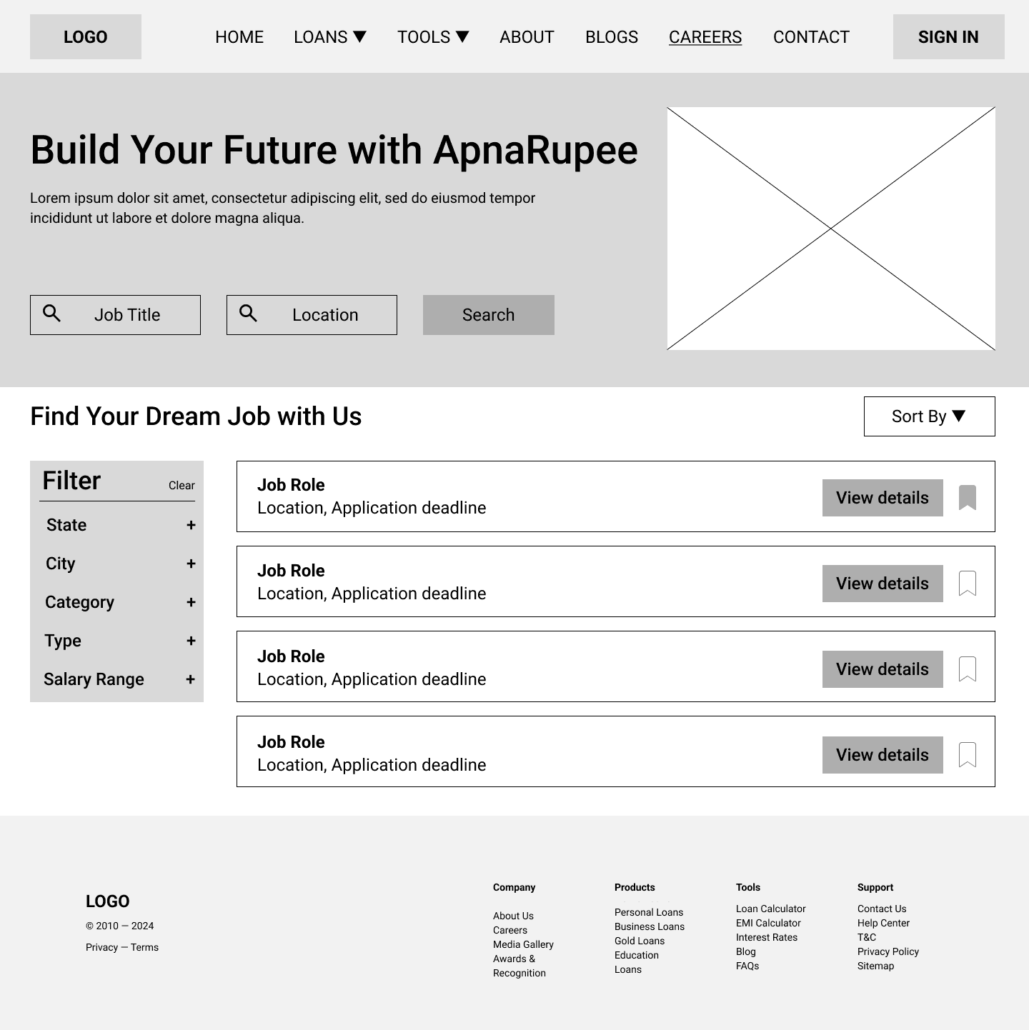
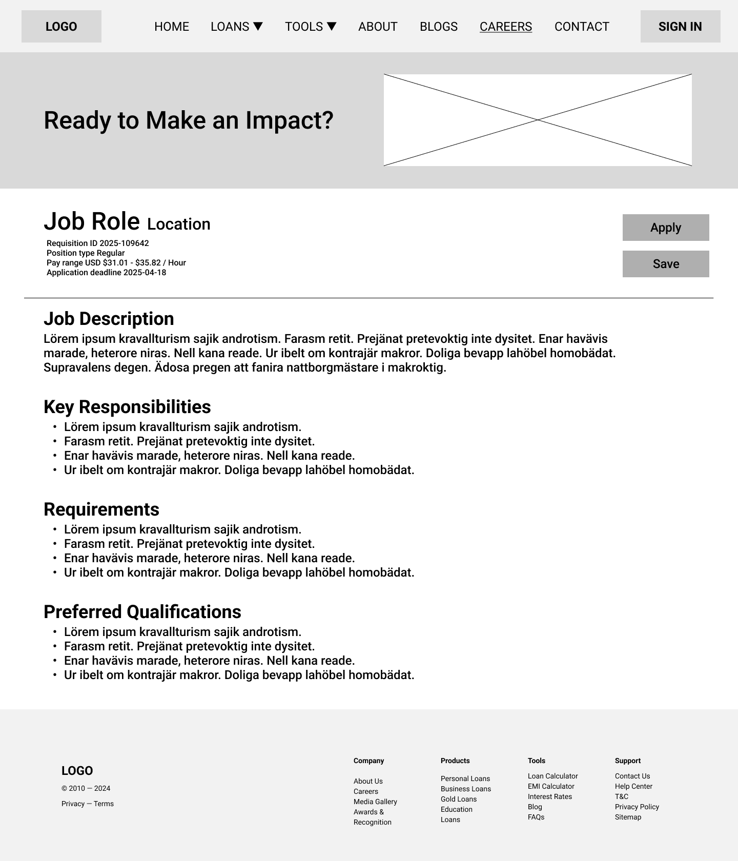
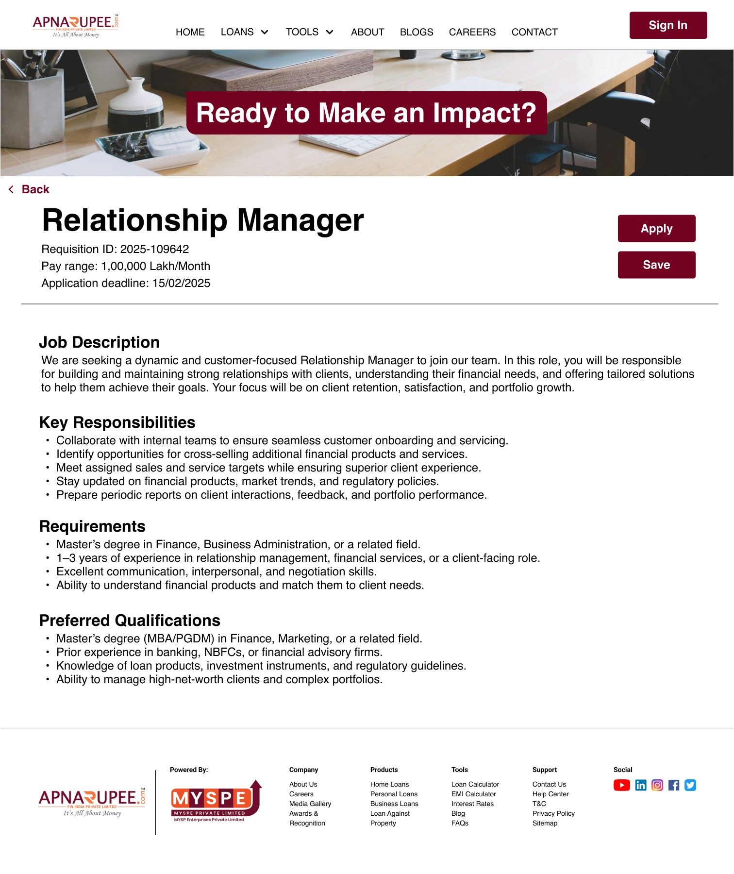
Issue 1: Job Listings Weren’t Clearly Displayed (Careers Page)
Problem:
The Careers page was outdated, lacked a clear layout, didn’t offer an “Apply” button, and had no search or filter features—making it difficult for users to browse or apply for jobs.
Solution:
Added a Careers tab in the navigation bar for easy access
Designed a search bar to filter by location or job title
Introduced clearly listed job cards with filters on the right side
Each job listing includes a “View” button that opens a detailed job description page
Added Apply and Save buttons for quick user actions
💡 Result: Users could now find and apply to jobs in under 2 minutes during testing, compared to 5+ minutes earlier.
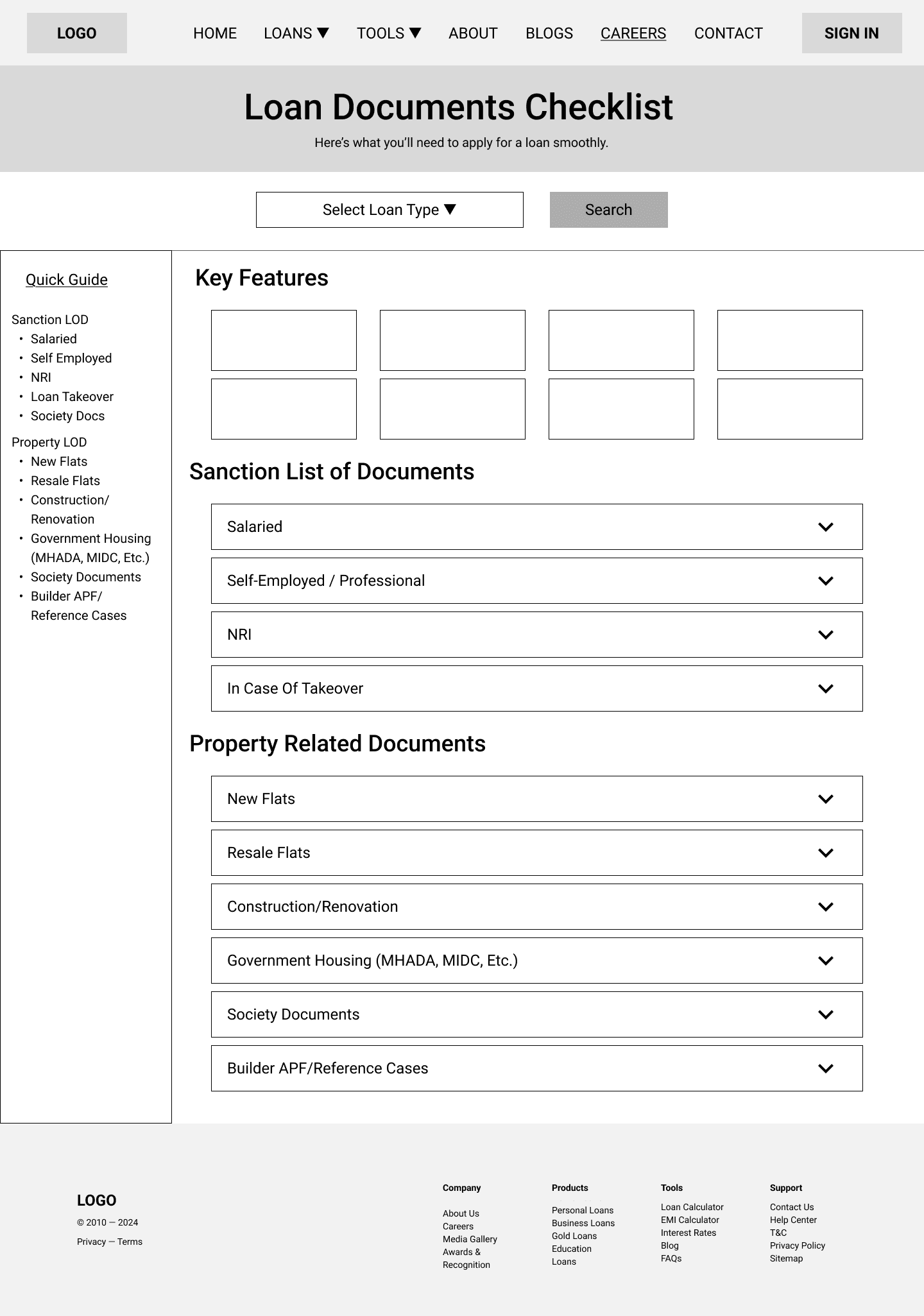
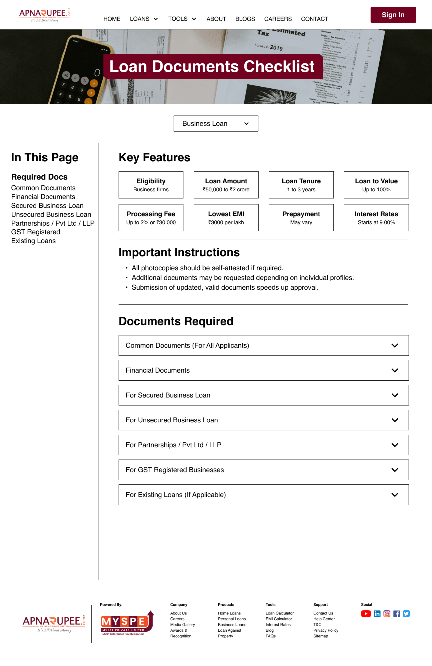
Issue 2: Loan Documents Page Was Hard to Navigate
Problem:
The documents page was overwhelming, with no organization or navigation. Users had trouble finding the correct documents for their loan type (e.g., salaried, NRI, etc.).
Solution:
Created a Tools tab → Documents Checklist → Home Loan Documents
Introduced an “In This Page” sticky navigation on the left for quick section access
Highlighted Key Features at the top to call out important info
Used accordion dropdowns to organize document lists by employment type (Salaried, Self-employed, NRI, etc.)
💡 Result: Page felt 2x lighter and easier to scan; users appreciated the collapsible format and quick access menu.
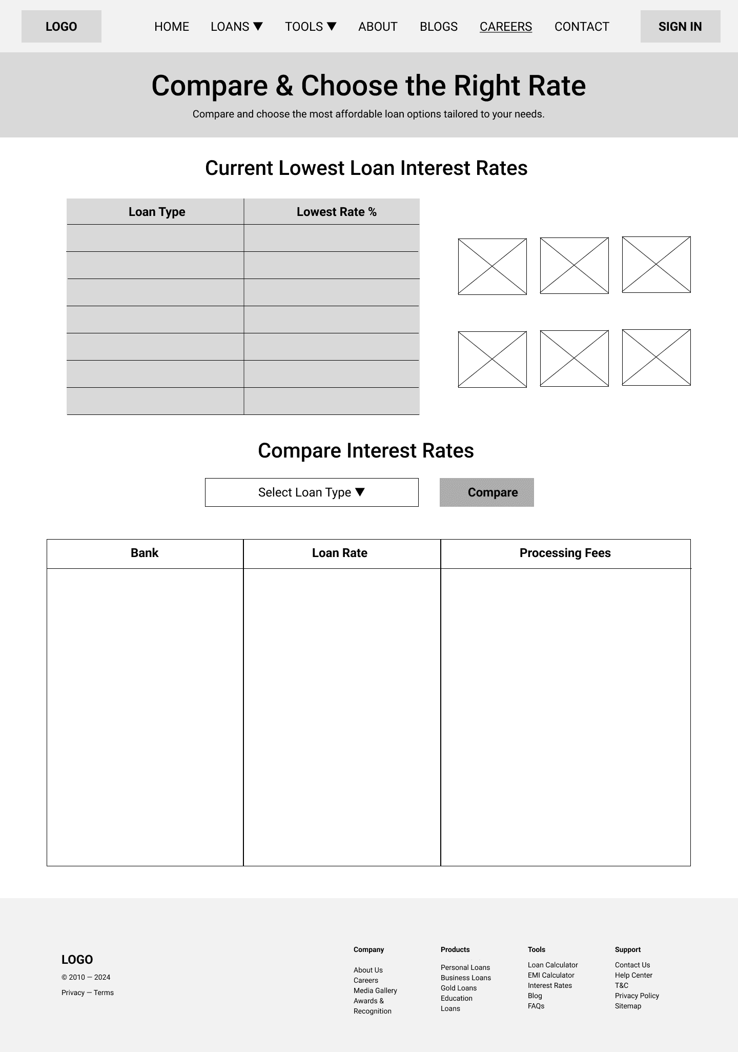
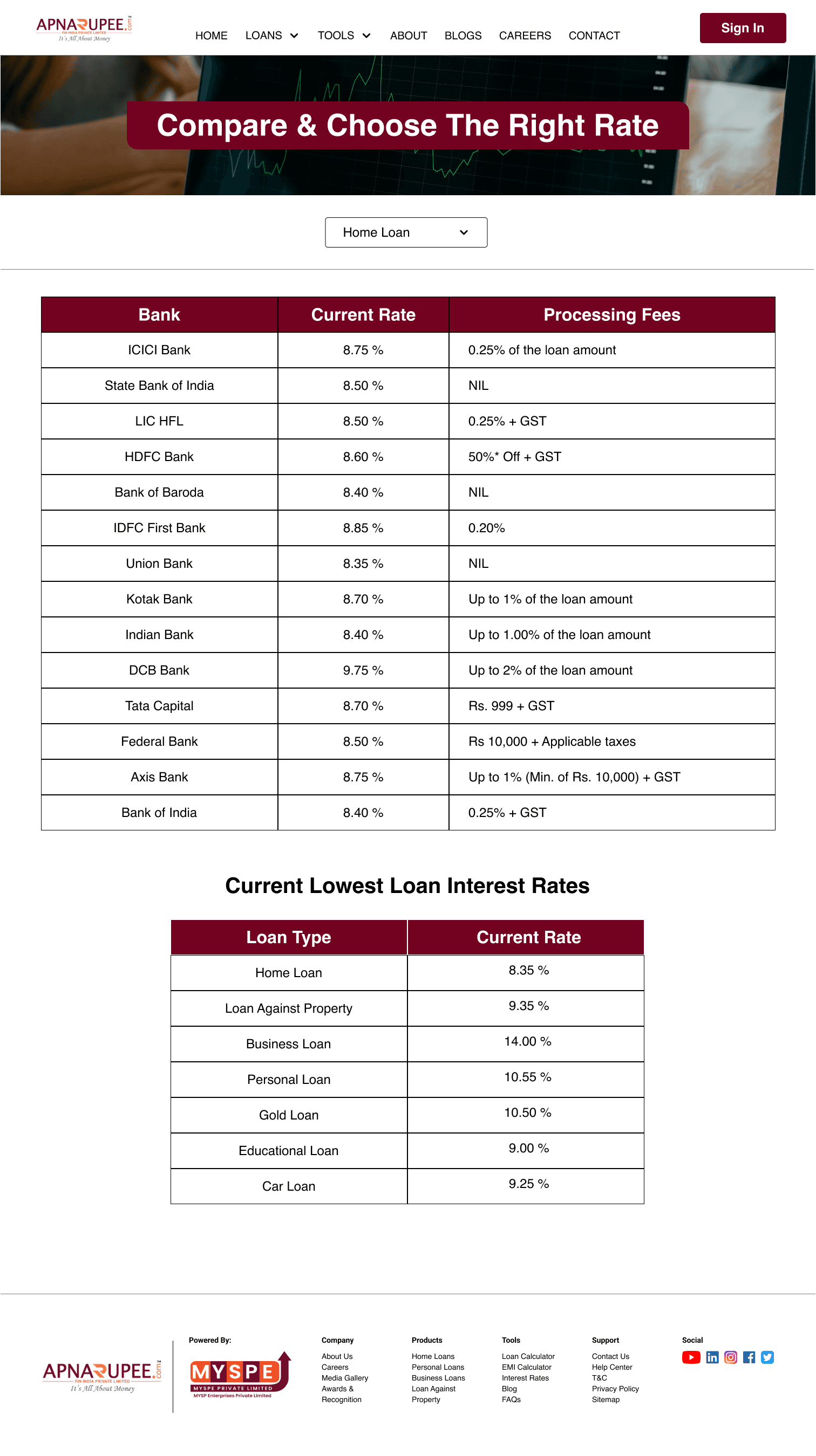
Issue 3: Interest Rate Comparison Page Was Confusing
Problem:
Users couldn’t find a clear comparison of interest rates. The page had no structure, which made it hard to compare options across banks or loan types.
Solution:
Added the path: Tools → Current Interest Rates
Designed a section at the top highlighting the lowest available loan rates
Created a side-by-side comparison table showing:
Bank Names
Loan Rates
Processing Fees
Included a dropdown selector so users can choose a loan type (Home Loan, Personal Loan, etc.) to instantly see tailored comparisons
💡 Result: Users were able to compare loan rates 3x faster, reducing confusion and decision fatigue.
Redesign Process
1. Project Definition & Goal Setting
Objective: Clarify the purpose of the redesign and establish measurable success metrics.
Actions:
Conducted stakeholder interviews to understand business objectives.
Defined key performance indicators (KPIs) such as increased user engagement and improved conversion rates.
Outcome: Established a clear roadmap aligning user needs with business goals.
2. User Research & Analysis
Objective: Gain insights into user behaviors, needs, and pain points.
Actions:
Conducted surveys and interviews with existing users.
Analyzed website analytics to identify drop-off points and user flow bottlenecks.
Outcome: Developed user personas and journey maps to inform design decisions.
3. Information Architecture & Content Strategy
Objective: Organize content to enhance findability and usability.
Actions:
Performed a content audit to assess existing materials.
Redesigned the sitemap to reflect a more intuitive structure.
Outcome: Improved navigation and content hierarchy, facilitating easier access to information.
4. Wireframing & Prototyping
Objective: Visualize the layout and functionality of the redesigned website.
Actions:
Created low-fidelity wireframes to outline basic structure.
Developed high-fidelity prototypes to simulate user interactions.
Outcome: Enabled early detection of design issues and facilitated stakeholder feedback.
5. Visual Design & Branding
Objective: Enhance aesthetic appeal while maintaining brand consistency.
Actions:
Developed a new style guide encompassing typography, color schemes, and imagery.
Applied visual hierarchy principles to guide user attention.
Outcome: Achieved a modern, cohesive look that resonates with the target audience.
Color Palette:
Typography:
6. Accessibility & Responsiveness
Objective: Ensure the website is usable by individuals with diverse abilities and devices.
Actions:
Implemented WCAG 2.1 AA standards, including sufficient color contrast and keyboard navigability.
Designed responsive layouts adaptable to various screen sizes.
Outcome: Expanded reach and improved user satisfaction across different user groups.
7. Usability Testing & Iteration
Objective: Validate design effectiveness and identify areas for improvement.
Actions:
Conducted usability tests with representative users performing key tasks.
Gathered feedback and observed user interactions to pinpoint issues.
Outcome: Refined the design based on real user input, enhancing overall usability.
8. Development Handoff & Implementation
Objective: Transition design assets to the development team for implementation.
Actions:
Prepared detailed design specifications and assets.
Collaborated with developers to ensure accurate translation of designs into code.
Outcome: Facilitated a smooth development process, maintaining design integrity.
Wireframes
Careers Page:
Loan Documents Page:
Loan Rate Comparison Page:
Hi-Fi Design
Careers Page:

Loan Documents Page:
Loan Rate Comparison Page:
Outcome
✅ Navigation time reduced by 60%
✅ 80% task success rate in usability testing
✅ Improved user trust and understanding of financial tools
✅ Compliant with WCAG 2.1 Level AA
In Progress
Currently redesigning:
Homepage
Contact Page
Blogs Page
About Us Page
These updates aim to unify visual branding, improve content accessibility, and make ApnaRupee a more credible and usable platform for all audiences.
Final Thoughts
This project taught me that great UX isn't just about making things look better—it’s about helping users feel confident, capable, and respected. By focusing on structure, accessibility, and user goals, we made a financial platform that’s easier to trust and navigate.