Sentier
Sentier is a research and design agency focused on user-centric and data-driven solutions. The goal of this project was to design a website that effectively communicates Sentier’s expertise while ensuring a seamless, engaging user experience. The website needed to balance minimal aesthetics with interactive elements that enhance usability without adding complexity.
Problem Statement
Despite its strong capabilities in UX research and digital transformation, Sentier needed a website that clearly communicated its value proposition. Many competing websites in the industry suffered from issues such as information overload, complex navigation, and lack of engaging interactivity.
This project aimed to solve the following:
How can we create a website that effectively conveys Sentier’s expertise without overwhelming the user?
How can we ensure that the content remains digestible while maintaining a minimal, elegant aesthetic?
What are the expectations and behaviors of potential clients when interacting with a research and design agency website?
Research & Analysis
User Research
To understand the target audience, I conducted secondary research and competitor analysis to identify the expectations of businesses looking for UX research and design services.
Target Audience
Business Executives & Decision-Makers: Looking for quick insights into Sentier’s expertise and credibility.
Product Managers & Designers: Interested in Sentier’s approach, case studies, and methodologies.
Startups & Tech Companies: Seeking digital transformation strategies and consulting services.
Key User Needs & Pain Points
After analyzing industry trends and user expectations, the following key pain points emerged:
Information Overload: Many UX agencies present excessive content and technical jargon, making it difficult for users to find relevant information.
Lack of Clear Differentiation: Many competitors fail to highlight what makes their approach unique.
Poor Navigation & Flow: Websites often lack intuitive navigation, making it difficult for users to explore services and case studies.
Dated Aesthetics & Interactions: Some sites feel static and uninspiring, lacking engaging visual storytelling.
Competitor Analysis
I analyzed five leading UX research and design agencies and identified key gaps:
Some had too much content upfront, making it difficult to scan.
Others used complex jargon that alienated non-technical users.
Many lacked a clear visual hierarchy to guide users through key information.
Few made use of motion or interactivity, missing an opportunity for engagement.
Design Process & Decisions
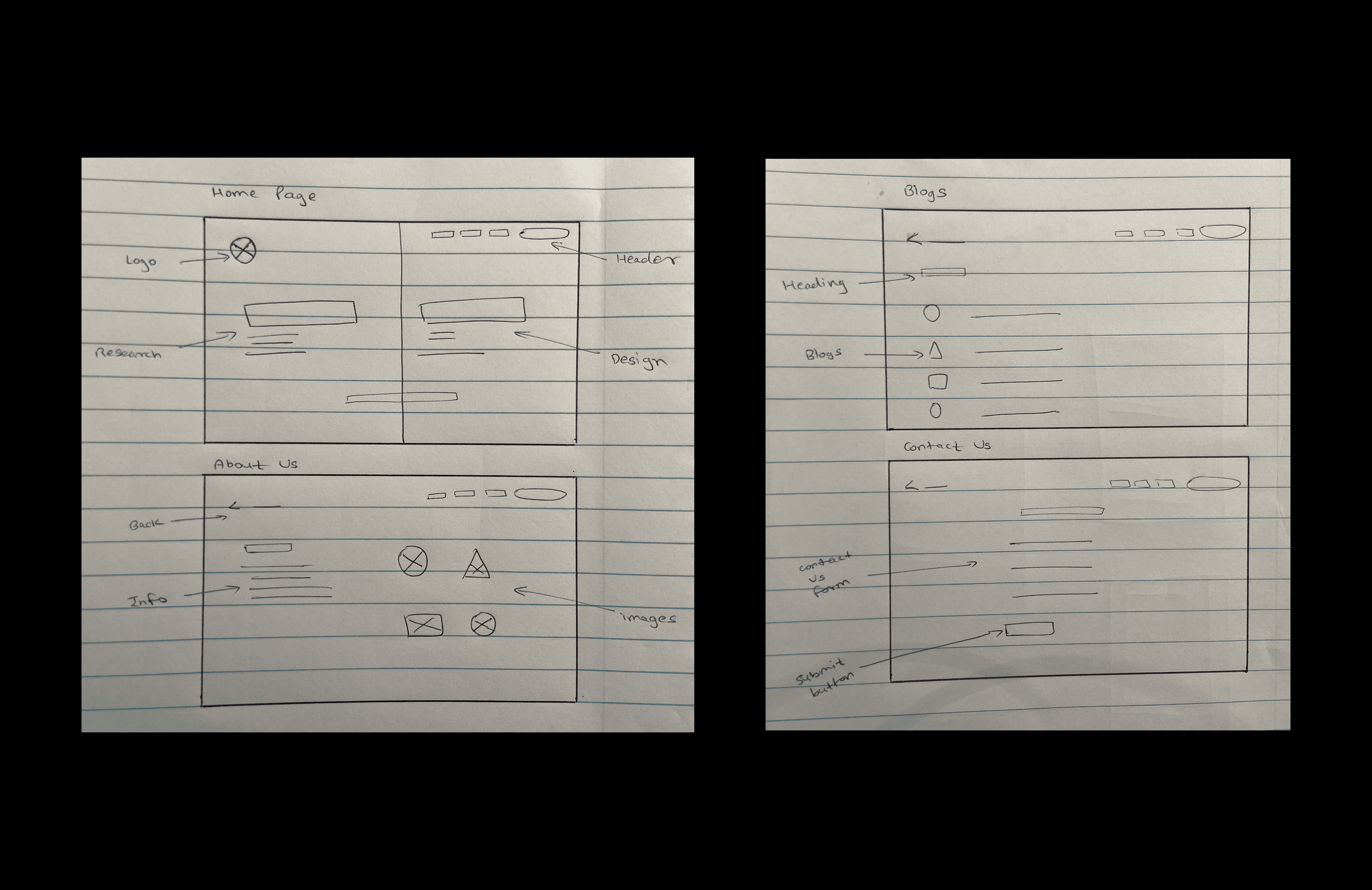
1. Information Architecture & Wireframing
To combat information overload, the website was structured with a clear hierarchy, guiding users through key content in a logical sequence.
Simplified Navigation: Created a straightforward menu with essential pages: Home, Blogs, About Us, and Contact.
Progressive Disclosure: Only the most relevant content is shown upfront, with options to explore deeper insights if needed.
Concise Messaging: Streamlined content to be direct and digestible, eliminating unnecessary complexity.
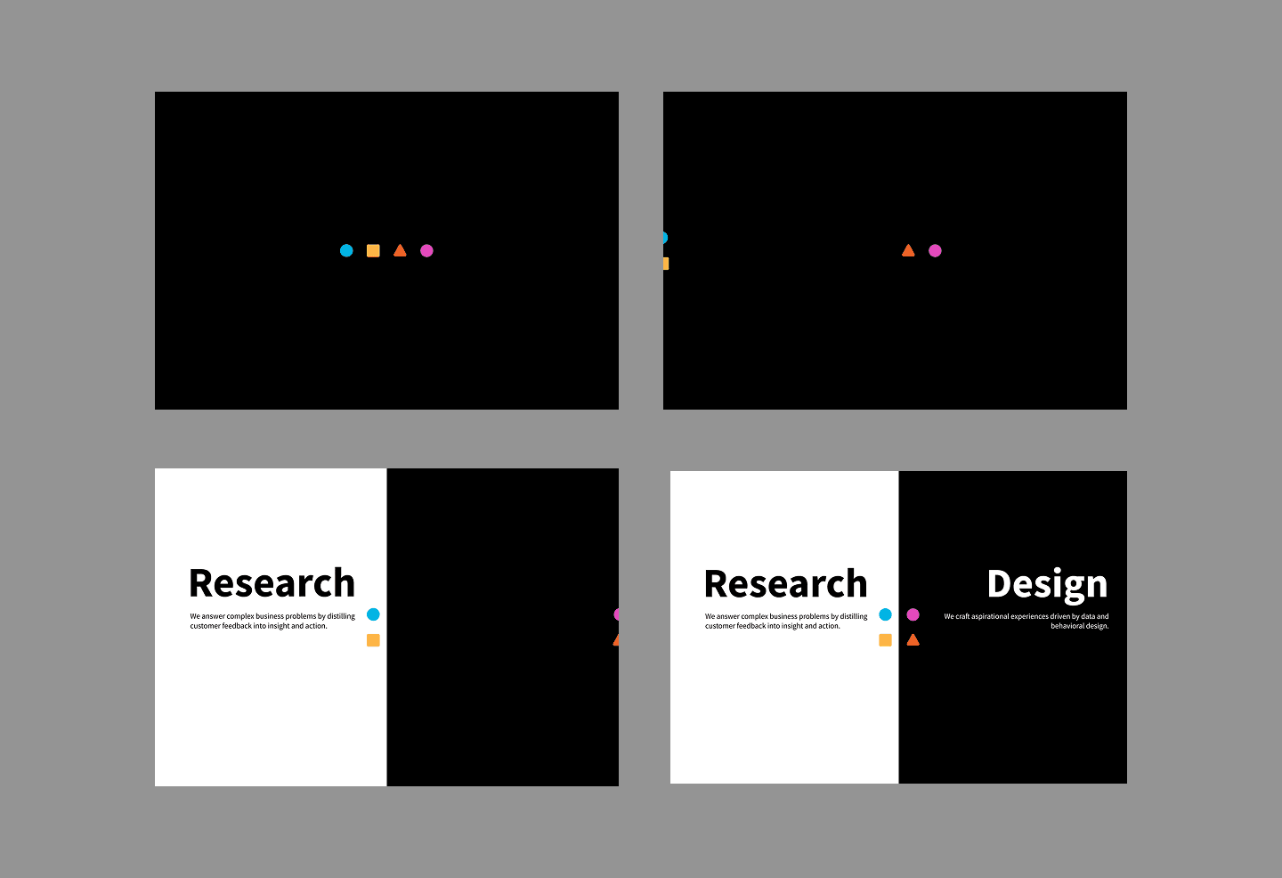
2. Smart Animations & Interaction Design
To differentiate Sentier, the design embraced a minimalist yet sophisticated approach, balancing simplicity with engaging interactivity.
Smart Animation for Screen Transitions: Implemented smooth animations that guide users seamlessly from introductory screens to the home page, enhancing engagement while maintaining a lightweight feel.
Whitespace & Readability: Ensured content was easy to scan with a clean layout.
Visual Hierarchy: Used typography and layout to guide users through the most important information first.
Hover & Scroll Interactions: Created subtle micro-interactions that provide feedback without overwhelming the experience.
3. Prototyping & User Testing
After wireframing, a high-fidelity interactive prototype was built in Figma and tested with a small group of target users.
Key Usability Insights & Refinements
Users wanted faster access to key services, so the navigation was adjusted to prioritize services upfront.
Some found animations distracting when overused, leading to refinements to make transitions more subtle and purposeful.
Users appreciated the clarity of content but wanted more case study examples, which led to the addition of a section highlighting Sentier’s past work.
Final Solution & Key Features
Minimalist Aesthetic – A sleek, modern design that avoids clutter and focuses on clarity.
Smart Animations – Subtle interactions and smooth screen transitions that enhance user experience.
User-Centric Navigation – Designed for quick access to relevant information.
Scalable & Flexible – The modular layout allows for easy content updates.
Screens:
Smart Animation
Home Screen

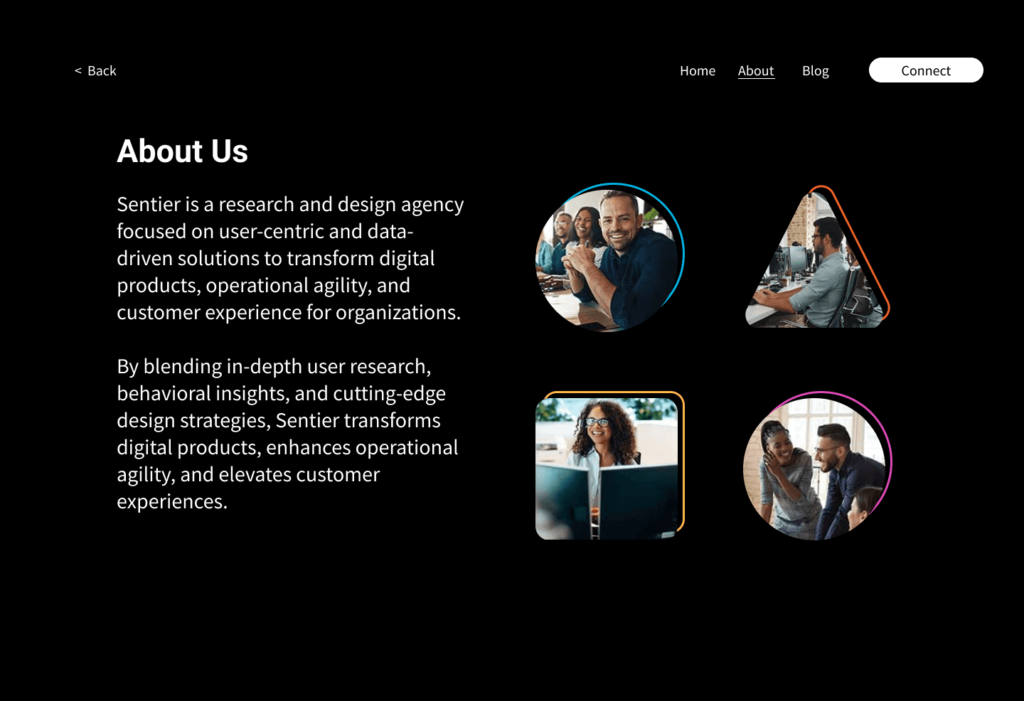
About Us Screen
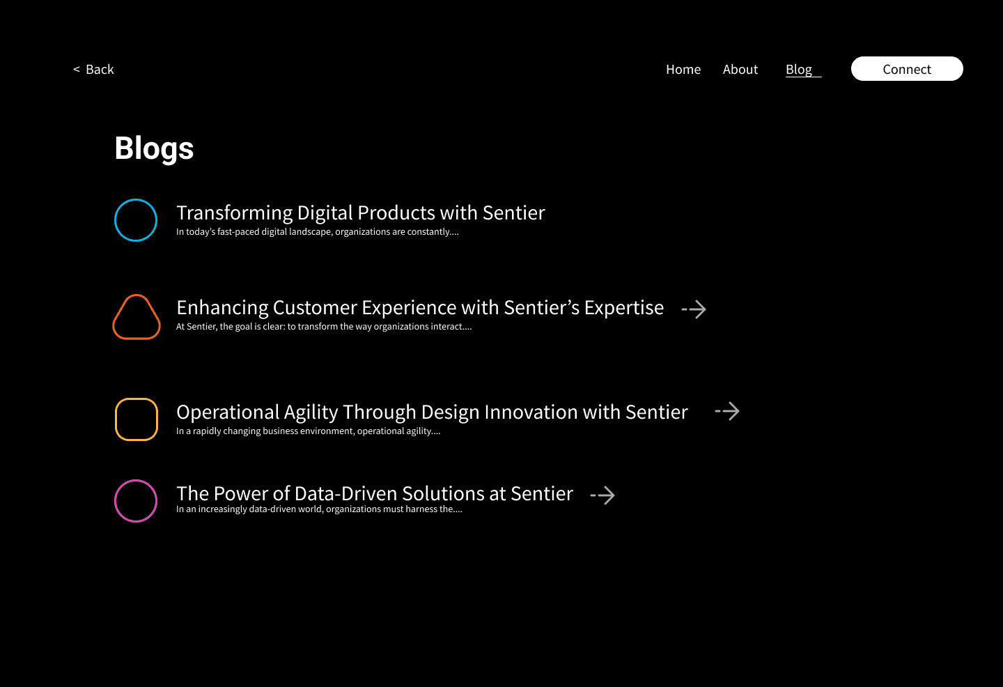
Blogs Screen
Contact Us Screen

Outcome & Impact
The redesigned Sentier website successfully provides a seamless and engaging user experience, aligning with both the agency’s brand identity and user needs. The refined structure, combined with minimalist aesthetics and intelligent interactions, ensures an effortless yet dynamic browsing experience.